Why Vizioneer?

- Nelson Davis
- Atlanta, Georgia, United States
- The "Vizioneer" comes from mashing two words that have shaped my world for most of my adult life - Engineer and [data] Visualizations (or Vizes to those who know what's up). Graduating from first from Oglethorpe University in Atlanta, followed by Georgia Tech with my Bachelors and Masters in Civil Engineering, all of which taught me to think through anything and everything - problem solving, "engineering" solutions, teaching to the "ah ha" moments - is what I love to do. In 2010 that investigative, engineering mindset intersected a job change and a plunge into the world of Data Analysis. In the search for the next great thing I stumbled on to a data visualization and dashboarding product called Tableau software and things just took off. So now I guess you could call me that engineer with the sweet data visualizations - or just "The Vizioneer" :)
In 2013, I joined the incredible team at Slalom, focusing on Tableau and it's been an amazing experience. Recently in 2014, I was honored and humbled to receive Tableau's highest recognition of being named a Tableau Zen Master. Follow along to see what happens next :)
Thursday, December 4, 2014
ATUG Presentation - Dec 2014
Thanks to everyone that joined for the December 2014 Meeting of ATUG. Below are the two resources from that meeting of the presentation and the Tableau Workbook that was demoed. I hope it helps! Many thanks!
Wednesday, September 24, 2014
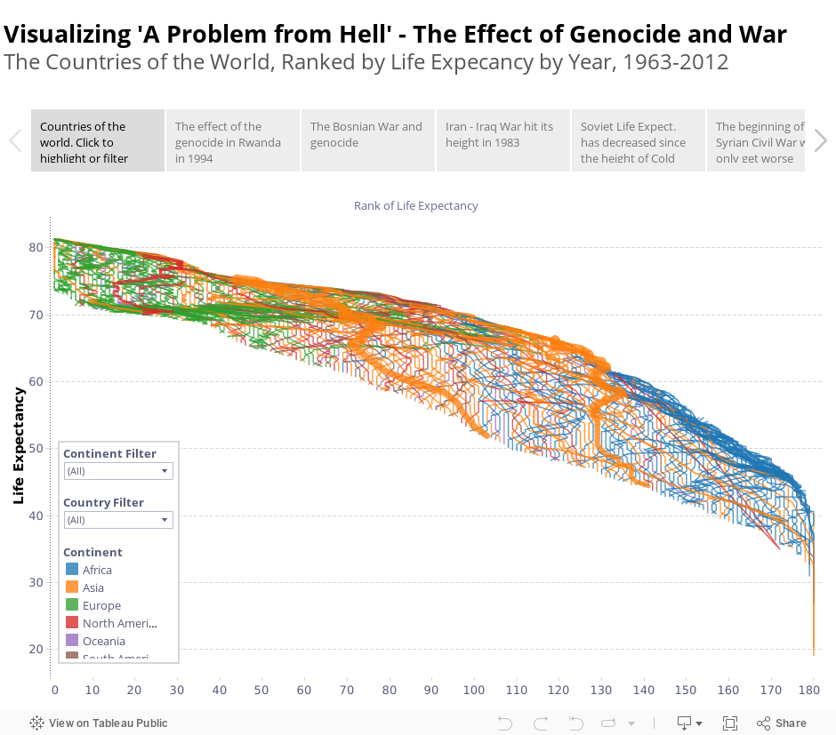
The Effect of War and Genocide
Earlier today Adam McCann put together a fantastic that looks at Life Expectancy by country, inspired by the great Hans Rosling.

Great vizzes often lead to the discussion of "how they do that?" and the beautiful thing about Tableau Public is that you can download and reverse engineer it to see what's going on. Being the curious fellow that I am, I did exactly that and found some interesting things. I also thought it would be interesting to look at the data with a slightly different X-Axis, simply the countries' rank of life expectancy, which in effect creates a massive bump chart.

But it also did something else. The lines of some of the countries had massive shifts in short amounts of time. I began to ask myself why that would be - "What would cause a large decrease in life expectancy rapidly?" It turns out that the answer is very sobering - Genocide and War.
When I was in school at Oglethorpe University (before my days at Georgia Tech), I read a book called "A Problem from Hell" by Samantha Power (the current United States' Ambassador to the United Nations) that examined America's role in Genocide in the 20th century. It was one of the most moving and core-shaking books I've ever read.
And so I began to look at this data differently, and I almost fearfully clicked to find Rwanda - the story of genocide which we studied and I knew all too well. The massive loss of life in the early 1990's lit the screen. The loss of over 1 million people shown in a single line.

I let that image sink in to the best of my ability, but frankly it took my breath away.
I next found Bosnia, where about the same time, early 1990's, Slobodan Milosevic was exterminating his people.
Then the Iran - Iraq War from the early 1980's, when both countries experienced tremendous losses as they killed each other.
That was followed by the 'Soviet' people - Russia and Ukraine - losing ground over the past 50 years (even through 2011).
There's even the early effect of the Assad regime and Syrian Civil War which started in Spring 2011 and continues to spiral out of control currently at the hands of ISIS. Future data will likely show what we already fear to be true - another genocide and civil war with devastating results.
And there was Cambodia. I actually was about to exclude this as I thought it was bad data. To see that the life expectancy in 1977 was short of 20 years old, I thought there must have been something wrong. But there wasn't.
Today I learned about the Cambodian genocide of the late 1970's where an unimaginable 1.5M-3M people lost their lives. It's difficult to comprehend. But you can see it in the data.

Putting this together has been very moving and sobering. Please have a look for yourself:
I look forward to your thoughts. Many thanks -
Nelson Davis
Great vizzes often lead to the discussion of "how they do that?" and the beautiful thing about Tableau Public is that you can download and reverse engineer it to see what's going on. Being the curious fellow that I am, I did exactly that and found some interesting things. I also thought it would be interesting to look at the data with a slightly different X-Axis, simply the countries' rank of life expectancy, which in effect creates a massive bump chart.
But it also did something else. The lines of some of the countries had massive shifts in short amounts of time. I began to ask myself why that would be - "What would cause a large decrease in life expectancy rapidly?" It turns out that the answer is very sobering - Genocide and War.
When I was in school at Oglethorpe University (before my days at Georgia Tech), I read a book called "A Problem from Hell" by Samantha Power (the current United States' Ambassador to the United Nations) that examined America's role in Genocide in the 20th century. It was one of the most moving and core-shaking books I've ever read.
And so I began to look at this data differently, and I almost fearfully clicked to find Rwanda - the story of genocide which we studied and I knew all too well. The massive loss of life in the early 1990's lit the screen. The loss of over 1 million people shown in a single line.
I let that image sink in to the best of my ability, but frankly it took my breath away.
I next found Bosnia, where about the same time, early 1990's, Slobodan Milosevic was exterminating his people.
Then the Iran - Iraq War from the early 1980's, when both countries experienced tremendous losses as they killed each other.
That was followed by the 'Soviet' people - Russia and Ukraine - losing ground over the past 50 years (even through 2011).
There's even the early effect of the Assad regime and Syrian Civil War which started in Spring 2011 and continues to spiral out of control currently at the hands of ISIS. Future data will likely show what we already fear to be true - another genocide and civil war with devastating results.
And there was Cambodia. I actually was about to exclude this as I thought it was bad data. To see that the life expectancy in 1977 was short of 20 years old, I thought there must have been something wrong. But there wasn't.
Today I learned about the Cambodian genocide of the late 1970's where an unimaginable 1.5M-3M people lost their lives. It's difficult to comprehend. But you can see it in the data.
Putting this together has been very moving and sobering. Please have a look for yourself:
I look forward to your thoughts. Many thanks -
Nelson Davis
Monday, September 22, 2014
DATA14 - It's all about people
What an amazing
week at DATA14.
AMAZING.
For me the
conference this year was all about the people.
So many of you went out of your way to chat me up and share
congrats. I had one person do one of
those “You’re Nelson Davis – like THE Nelson Davis!” I laughed because I did the same thing when I
meet Jonathan Drummey, Joe Mako, Anya A'Hearn, Ramon Martinez, Alan Walker
(who’s Scottish btw – there’s an accent that will blow your mind when you’re
not expecting it!), Peter Gilks (we’d actually never met in person though we’ve
talked dozens of times), John Mathis (same story), Ben Jones, Jewel Loree, Matty Francis :), Emily, Paul
B., Chappie, Francois, Andy Cotgreave, Craig Bloodworth, and (the cheery on
top) Chris Stolte to name a few. The
talent and creativity on display was amazing.
These vizzes don’t make themselves.
The conference reminds us all that there’s incredible, genuine people
behind this stuff. And if I’ve created
anything that people found useful, it’s only because I’ve received the same at
100 to 1. Being named a Zen Master is an
incredible honor, and very humbling. Some
of us newbies have had some soul searching moments to wonder if we really
deserve to stand on the same stage with the legends. The conference made me realize that while I’ll
never get table calcs like Jonathan and Joe or design as beautifully as Anya
and Kelly, I still have a place and something special to offer. I had to remind myself that I bring passion
and I live to teach to the ‘light bulb’ moment.
I’ve never met a microphone I didn’t want to talk with. I’ve found methods to explain complicated things
in ways that those just beginning their journey can easily grasp. I love to
serve this community and give what I can to push the limits of what’s possible by
however much. I think the beautiful explanation
of data can change the world, and I’m out to preach that gospel till the cows
come home. And so are you. So are we.
Data14 reminds
us of why we are so passionate about what we do.
I’ve sometimes
called it the ‘Christopher Columbus’ moment – when we take data that’s never
been brought together, breathe life into it and see things no one’s ever seen;
understand that which was previously impossible. And we are those pioneers. We
are the ones with vizion (see what I did there?). It gives me goosebumps to think about it.
Tableau’s a game
changer. It’s one of the most flexible
and amazing things I’ve ever seen. And
yet, like I said before, these vizzes don’t make themselves – you amazing
people are everywhere, doing amazing things.
I can’t wait to see what happens by Data15. Viz on my friends, viz on.
Sunday, August 17, 2014
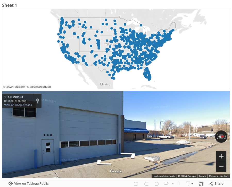
Tableau and Google Maps - Finally friends again!
How to integrate the Google Maps APIs with Tableau
Oh mapping, how I love thee. Some of you may know that in a previous life (like less than a year ago) I lived in a transportation world. A transportation civil engineer by trade, all my analysis was about maps, points and asset management all over the beautiful city of Atlanta. One of the coolest things that I ever did was to figure out how to create a magical URL that allowed me to feed a latitude and longitude into a Tableau web page and have a fully interactive Google Street View window showing me what was going on at that location. It was my first really big Tableau hack and when I showed it as part of my potential presentation for TCC 2013 the people that saw it at Tableau had never seen it before (which is probably why I got to speak last year in Washington, DC). Back then it was a fairly simple and elegant trick, you just needed to have the magical URL and it would work basically just like the example you see below:
The problem is if you want to recreate this functionality and you start by downloading the above Tableau Public workbook you open it up and immediately see some ugliness:

So what happened? The "New" Google Maps happened, that's what. It's here and it's breaking all the cool stuff that tons of cool people put together. Here's what happens when you download the Google Maps example from Ben Jones (one of the be known examples of this integration). It goes from this:

to this:

So what can we do?
This saddened me. The lowest moment of my sadness happened the night of April 8, 2014 - as I attempted to show how to integrate Google Street View into Tableau for the day 9 (birthday edition) of the Tableau 30 for 30 (it WAS my favorite trick!) That night I fought with Google for over 2 hours trying to make this work. I had to switch to Bing maps before I could declare any kind of victory, but it just wasn't the same. While the "New" Google Maps made it seem impossible, I had the feeling that if I could employ a different skill set and leverage the Google Maps APIs the situation could be made whole again.
This past week I finally had an occasion to dig back into this problem. And I'm happy to announce that I have returned a victorious man - Google Street View is ours once again! I have to warn you, it's not as simple as it once was, but if you are bold (and knowing someone who does JavaScript doesn't hurt) this solution can once again make you the coolest kid on the block. There's two levels of making this work - a fairly basic way that allows you to have this work on a local machine and a more advanced method that allows this to work on any machine. I'll walk you through both, at least sorta :)
How does it work?
In general terms, here's what we're going to do - we're going to use Tableau URL actions in a dashboard to feed the latitude and longitude of a location selected on a map. The URL is going to reference an HTML webpage that uses JavaScript to take in the Latitude and Longitude from Tableau and display a Google Street View interactive page. Sound simple? It's easier than you think.
Getting a Google Maps API Key
First things first - for both solutions you're going to need a Google Maps API key. Don't have a Google account? It's time to join the NSA and the rest of us and get one. Once you have that in place, it's time to get going with your API Keys by going here. Decide which APIs you want to turn on. Me? I turned on most anything that looked like it had to do with Maps and was free :)

Go ahead and make your note of that API key, as we're going to need it in just a minute.
Set up a Tableau Dashboard
This is as simple as having a map with points on it, bringing it on to a dashboard and adding a blank webpage that will ultimately return our Google Street View. Here's a simple example:
You're going to take your dashboard, with the map and blank web page and feed it a magical URL - here's what goes into it...
How to setup and create the URL Action
The URL is going to reference one of the HTML files from here (or you can write your own - and send me a copy), which has your Google Maps API key pasted in (this is what you wrote down from above).

The file is then placed by you either on your local machine (like on your computer's C drive ) or a web server (like something that starts with http://....).
The file is then placed by you either on your local machine (like on your computer's C drive ) or a web server (like something that starts with http://....).
Placing the HTML file on your local machine is simplest, but this means that it can only be accessed by you on this one machine - not very useful if you plan on sharing this dashboard with anyone - or on Tableau Public.
If you want to share it with the world, you're going to need to use a web server. A web server is what starts with http://..... and can be accessed be anyone who can hit the server. Want to set one up? I did, using an Azure VM and Ben Sullin's favorite WAMP Server, the scope of which is above and beyond what we're going to cover here. Trust me, me teaching you about VMs and Web Servers would be the definition of the blind leading the blind - but take heart - if I can do it, so can you!
Ok, so once the HTML file is in place (and you note it's location) you can use these example of the URL you'll type into the Tableau URL action.
If the HTML file is on your local machine, then the URL looks something like this:
file:///<path to file>/gstreetview.html?lat=<Latitude>&lon=<Longitude>
or for example:
file:///c:/wamp/www/gmaps/gstreetview.html?lat=<Latitude>&lon=<Longitude>
If the HTML File is on a web server, then you just reference that:
http://<server ip or dns name>/<folder>/gstreetview.html?lat=<Latitude (generated)>&lon=<Longitude (generated)>
or for example:
http://tndtableau.cloudapp.net/gmaps/gstreetview.html?lat=<Latitude (generated)>&lon=<Longitude (generated)>
The file has javascript that takes in the two parameters that get named "lat" and "lon" in the url and returns a Google Street View fullscreen page right there in the dashboard. So when you put it all together you get something like this:
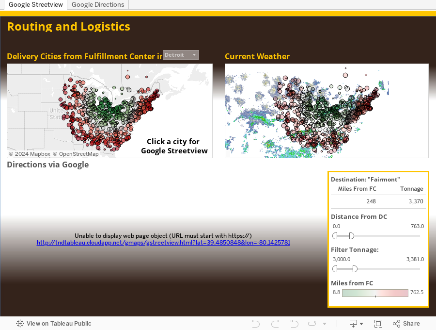
As you can see there's two tabs - one that's returning a Google Street View window and the other is returning directions for origin-destination routing. This is using a different HTML file, which is calling on the Google Maps Directions API, and feeding it four parameters OrgLat, OrgLon, DestLat, and DestLon. The point here is that ALL the APIs for any service could now be in your hands :) meaning that the possibilities are endless!
Also, so long as I'm running my web server (for which I make zero promises of level of service, and reserve the right to shut down at any time), you can use it for your own use. Just simply use the following URLs and you'll be able to leverage the Streetview and Directions sheets just as I have without having to host the files anywhere (because I'm hosting them for you - see what a nice guy I am?)
Street View:
http://tndtableau.cloudapp.net/gmaps/gstreetview.html?lat=<Latitude>&lon=<Longitude>
Directions:
http://tndtableau.cloudapp.net/gmaps/orgdestdir.html?OrgLat=<DC Latitude>&OrgLon=<DC Longitude>&DestLat=<Latitude>&DestLon=<Longitude>
I hope that helps! Welcome back to Google Maps to the Tableau Toolkit. Happy Mapping month. Can't wait to see everyone in Seattle in a couple weeks!
Nelson
Wednesday, June 18, 2014
Dynamic Parameters - a sorta hack
...And we're back.
It's been a little more than six weeks since I've saddled up and hopped on the blog. The #Tableau30for30 took a lot out of me and I've needed some time to recover :).
So dynamic parameters. It's the number one most requested feature idea in the Tableau Community. Everyone seems to have come across a time where this would come in handy. It's a great idea and given the demand it should be implemented sooner rather than later.
Unfortunately, it's not coming in the very soon to be released v8.2. You'll hear a lot about some very slick new features - Story Points and the Visual Data Window to name a few. But dynamic parameters ain't on the docket. So it's time we take matters in to our own hands.
Let's start at the beginning. What's the point of dynamic parameters? Here's the text from the idea page (currently with 870 votes - only one with over 320 votes):
In general terms it's:
Select [Your Dimension]
From [Your Datasource]
Group by [Your Dimension]
And using the SQL from above, what do we get?

A single value list with all of the Product Categories - this looks strikingly similar to the parameter we created, except for one thing. This is dynamic. This list will change if the underlying data would change.
So we've created this dynamic list - what can we do with it? Basically anything we want - we can do most of the same things we could do with parameters - use it in formulas, use it in quick filters (single select or multi-select - the second option is not currently possible with a parameter), etc.... The sky is the limit. Here's an example:

Notice the two data sources. Superstore is our primary data source and the single value list dynamic table based on Categories is the secondary source. Creating a multi-select quick filter works like a champ (make sure the two data sources have the correct links and relationships - which Tableau will make sure of if the headers have the same names).
Interesting stuff, I say.
Is it a perfect solution. Nope - it's a hack. Are there a dozen reasons why it's not a best practice? I'm sure there are, and I'm sure the comments section below will let that play out. But with all that said - could it help solve a problem you're having? It just might.
It's a crazy simple solution and my hope is that it sparks a conversation. I by no means think this is anywhere near the last word on this topic, but with v8.2 walking out the door, it's time we begin to amass ideas for v9.0.
I look forward to your feedback. Many thanks-
Nelson
It's been a little more than six weeks since I've saddled up and hopped on the blog. The #Tableau30for30 took a lot out of me and I've needed some time to recover :).
So dynamic parameters. It's the number one most requested feature idea in the Tableau Community. Everyone seems to have come across a time where this would come in handy. It's a great idea and given the demand it should be implemented sooner rather than later.
Unfortunately, it's not coming in the very soon to be released v8.2. You'll hear a lot about some very slick new features - Story Points and the Visual Data Window to name a few. But dynamic parameters ain't on the docket. So it's time we take matters in to our own hands.
Let's start at the beginning. What's the point of dynamic parameters? Here's the text from the idea page (currently with 870 votes - only one with over 320 votes):
Parameters are really useful when you need to do something too complex to be handled by quick filters or action filters. However parameters are currently hobbled by the fact they have to be static lists.
It would be really, really useful and solve a lot of Tableau gotchas, if you could define the options available for a parameter dynamically, from the result of a datasource, and preferably with the option to apply filters also.
That's a bit about what dynamic parameters could do. Let's talk about what parameters are in general. Here's what we're NOT talking about - The type of parameter that is a numerical value that can be changed via a slider or typing something in that will affect calculations. Those parameters work great - no complaints there. Rather, what the "Idea" is typically talking about is a parameter based on a STATIC list (think one time snapshot) of values of a dimension in the data. Here's how it typically goes:
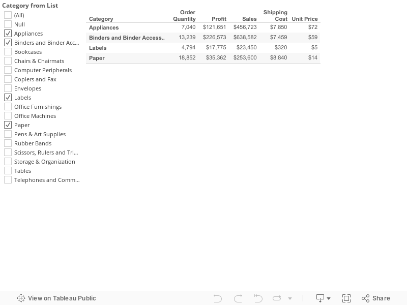
Create a new parameter>>Change the data type to "String">>Click the button for a "List" of Allowable values>>Select "Add from Field" and select the dimension to get your list of values (I'm using Superstore data and going with "Category")

This will create a list of values based on the dimension selected.

This static list now lives apart from your data set. If the data set changes (the company adds more product categories) this list will NOT update. This is the gripe. The thinking is that if the data changes, so should the parameter.
This will create a list of values based on the dimension selected.
This static list now lives apart from your data set. If the data set changes (the company adds more product categories) this list will NOT update. This is the gripe. The thinking is that if the data changes, so should the parameter.
So here we go. I'm going to propose an idea. Follow me for a minute.
When we create a list of values in a parameter, it's as if we're informally creating a new table of values, based on a snapshot of the data, that now lives outside the the data.
What if we just more formally create a table of values that remains based on the underlying data, yet lives outside of the full datasource (as a parameter would). What if, instead of calling this new table of a single dimension of data a "parameter", we called it what it really is - a small data source.
Here's what I'm proposing - Based on the same example from above (Creating a String Parameter from a List of Values based on the Category field), we head back to the data window and head for the Custom SQL. What? You don't like SQL? This is going to be the easiest three lines of code you've ever written. It goes like this:
In general terms it's:
Select [Your Dimension]
From [Your Datasource]
Group by [Your Dimension]
And using the SQL from above, what do we get?
A single value list with all of the Product Categories - this looks strikingly similar to the parameter we created, except for one thing. This is dynamic. This list will change if the underlying data would change.
So we've created this dynamic list - what can we do with it? Basically anything we want - we can do most of the same things we could do with parameters - use it in formulas, use it in quick filters (single select or multi-select - the second option is not currently possible with a parameter), etc.... The sky is the limit. Here's an example:
Notice the two data sources. Superstore is our primary data source and the single value list dynamic table based on Categories is the secondary source. Creating a multi-select quick filter works like a champ (make sure the two data sources have the correct links and relationships - which Tableau will make sure of if the headers have the same names).
Interesting stuff, I say.
Is it a perfect solution. Nope - it's a hack. Are there a dozen reasons why it's not a best practice? I'm sure there are, and I'm sure the comments section below will let that play out. But with all that said - could it help solve a problem you're having? It just might.
It's a crazy simple solution and my hope is that it sparks a conversation. I by no means think this is anywhere near the last word on this topic, but with v8.2 walking out the door, it's time we begin to amass ideas for v9.0.
I look forward to your feedback. Many thanks-
Nelson
Wednesday, April 30, 2014
Day 30: Cross Stitch Viz of Thank You
30.
We made it. We're here. I this is probably the closest I'll ever come to feeling like I'm on top of Mount Everest. I've thought a lot about what to say at this point. I'll level with you - this was a lot harder than I thought it would be. The content was interesting and I learned a ton, but man was this time consuming. On average I'm guessing I spent 2.5 -3 hrs a night writing each one of these, cradle to grave. It made for some looooong days, many of which lasted into tomorrow. But I think I'll soon look back and be happy I took this on AND completed it. I certainly wasn't alone in this quest and I'd like to take a few moments and say thank you to a number of people:


We made it. We're here. I this is probably the closest I'll ever come to feeling like I'm on top of Mount Everest. I've thought a lot about what to say at this point. I'll level with you - this was a lot harder than I thought it would be. The content was interesting and I learned a ton, but man was this time consuming. On average I'm guessing I spent 2.5 -3 hrs a night writing each one of these, cradle to grave. It made for some looooong days, many of which lasted into tomorrow. But I think I'll soon look back and be happy I took this on AND completed it. I certainly wasn't alone in this quest and I'd like to take a few moments and say thank you to a number of people:
- First off to my wife, Ms. The Vizioneer, for whom I owe about a month's worth of washing dishes, cleaning up, and paying attention to - tomorrow's May baby :) Wahoo!
- To Dan Montgomery who contributed in a number of ways along this journey and stepped up with a guest post at the end. I believe Dan favorite every single one of my #Tableau30for30 Tweets, so if you follow Dan you'll be happy May's coming as well.
- To John Mathis, Steven Carter, and Peter Gilks (the boys of Slalom), who stepped up when the towel was this close to being thrown, and provided some excellent posts that really enhanced the journey toward the end.
- To the great folks at Tableau - Ben Jones and Tara Walker - I can't believe that we were just randomly on the same page with April as Tricks and Tips month, but I'm grateful for the blog feature and Twitter hype! It was really encouraging to know that people all over the place were interested.
- And to the many of you who reached out in one way or another with many kind words of appreciation, I am honored to know that this made an impact for you.
If you've become an avid reader of the The Vizioneer, you probably shouldn't count on much new stuff coming out in May... but what am I talking about? We still have one more trick to cover for the 30th, so buckle up!
Before we get to what I ultimately did for Day 30, you should know that I've been pondering how to wrap this up for over a week. I thought about writing on the "ultimate trick", the trick to end all tricks, but it was a moving target depending on who you ask - Andy Kriebel's a pretty big fan of what he calls The Greatest Tableau Tip EVER: Exporting CSV made simple! which was worth considering. But then Andy Cotgrave and Matt Francis were big fans of putting bar charts in the the tooltip which I have to admit was a pretty awesome idea:
I'd hate to pick "the greatest trick ever" only to find out I was wrong :)
So I decided to go a different route. Inspired by Ms. Jewel Loree, creator of many beautiful Viz of the Day wins and a Tableau Public goddess, I give you Day 30 of #Tableau30for30 - Cross Stitch Viz of Thank You.
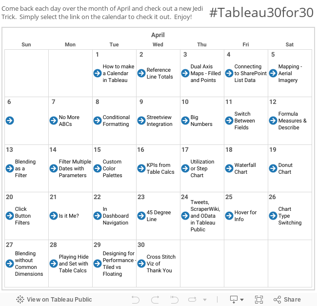
This is one of those we certainly have to show the end result before we dive it. So this is where we're headed:
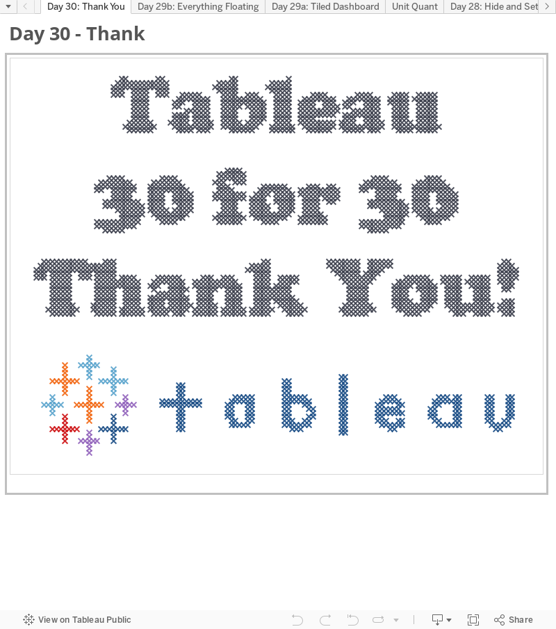
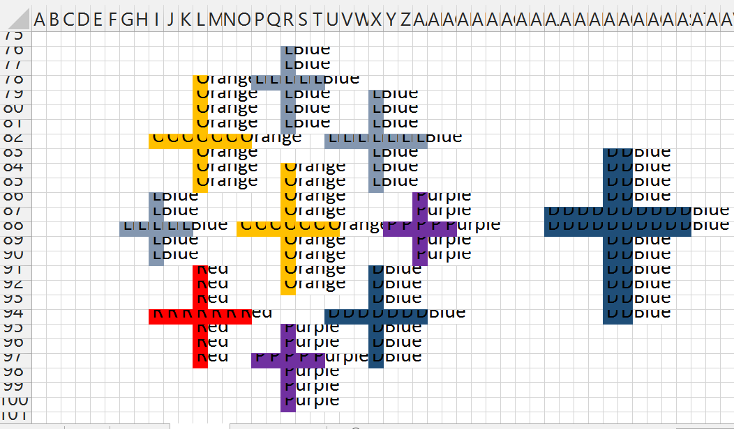
Pretty cool huh? How did we do it? Well Jewel gives a pretty awesome step by step on her blog, but I'll give you the dime tour. We actually start this shindig in Excel (because data doesn't just grow on trees or fall from the sky! It must be created!). He're what I did - I started by making each cell in Excel 10x10 pixel squares and numbered across the top and down the left side. Looks something like this:
Then inserted got some word art, found a font I liked, and wrote out a message in the word art. I then took the word art and made the fill transparent, added a solid outline and it looked something like this:
Next came the fun part. I manually went through and filled in each of the squares that had over 50% of the area as to be filled by the letters. This took a bit of time (as does anything worth doing - according to my Dad). But it soon looks like this:
You then do something that I previously didn't know was possible - Find and replace based on formating. This allows you to write in text where you have cells of a particular color. Once you go through and do everything, you have something that looks like this:
Now, some additional magic. If you haven't already downloaded the Tableau Excel Data Reshaper Add-in, then where have you been? Mother's been worried sick about you! You better go inside and eat your dinner!
We're going to start in cell B2 and select enough of the worksheet to get every bit of the design. We'll then fire up the Data Reshaper Add-in and pivot this to make it useable in Tableau. After it completes and we rename the columns we get this simple table:
It's pretty easy from here. Bring the sheet into Tableau, Y-Axis to rows and X-Axis to columns (both should be Dimensions rather than Measures), and Color on to the color shelf. Also worth noting, I had to reverse the direction of the Y-Axis (putting 1 on top, same as it was in Excel, rather than on the bottom as Tableau is used to putting it there). Selecting shape mark type and going with the "X" looking one, and.....
Voila!
We have a cross stitch you'd be proud to put up on the wall.
And with that, the sound of Boyz II Men tells me that we've come to the End of the Road.
It's been fun. Thanks for hanging out and following along. If you've enjoyed this, learned something new, or have a favorite trick I missed, hit me up on Twitter @Nelsondavis as I'd love to hear about it. I love to meet new people and TCC14 is but a short 4.5 months away - if you see me, please stop and say hey!
As always, many thanks -
Nelson
Subscribe to:
Posts (Atom)